


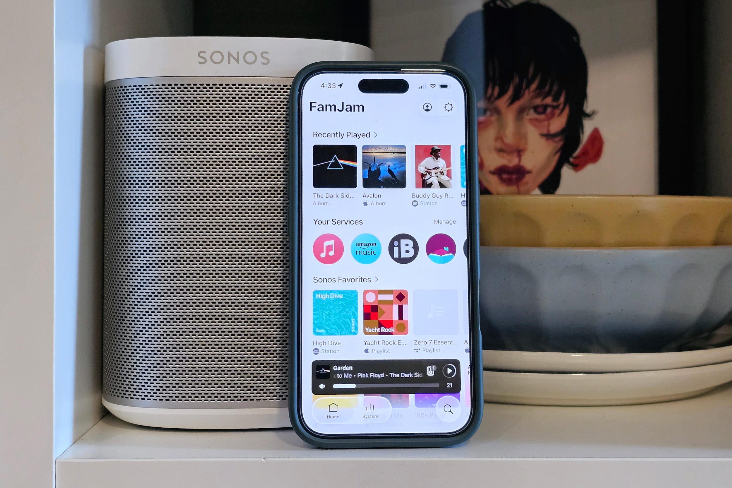
You can almost hear the collective held breath and the tentative, walking-on-eggshells approach that Sonos CEO Tom Conrad, and his team are taking at the moment. And well they should.
No one at the company has forgotten the “profound mistake” made in May 2024, when, under the leadership of Patrick Spence, Sonos launched a redesign of its mobile app.
That redesign was so poorly executed, and so poorly received by customers, that the company’s stock began a slide that shaved 50% of its value over the following 12 months. It also ended Spence’s eight-year run as CEO.
Since then, Sonos has been triaging the fixes. It started with the missing and broken features, moved on to performance bugs and now, more than two years after the launch, it’s giving some much-needed attention to the user interface.
However, unlike in 2024, the changes are being rolled out slowly and they can be turned on and off with a single tap. It’s a cautious, controlled, and considered approach, and who can blame Sonos for that?
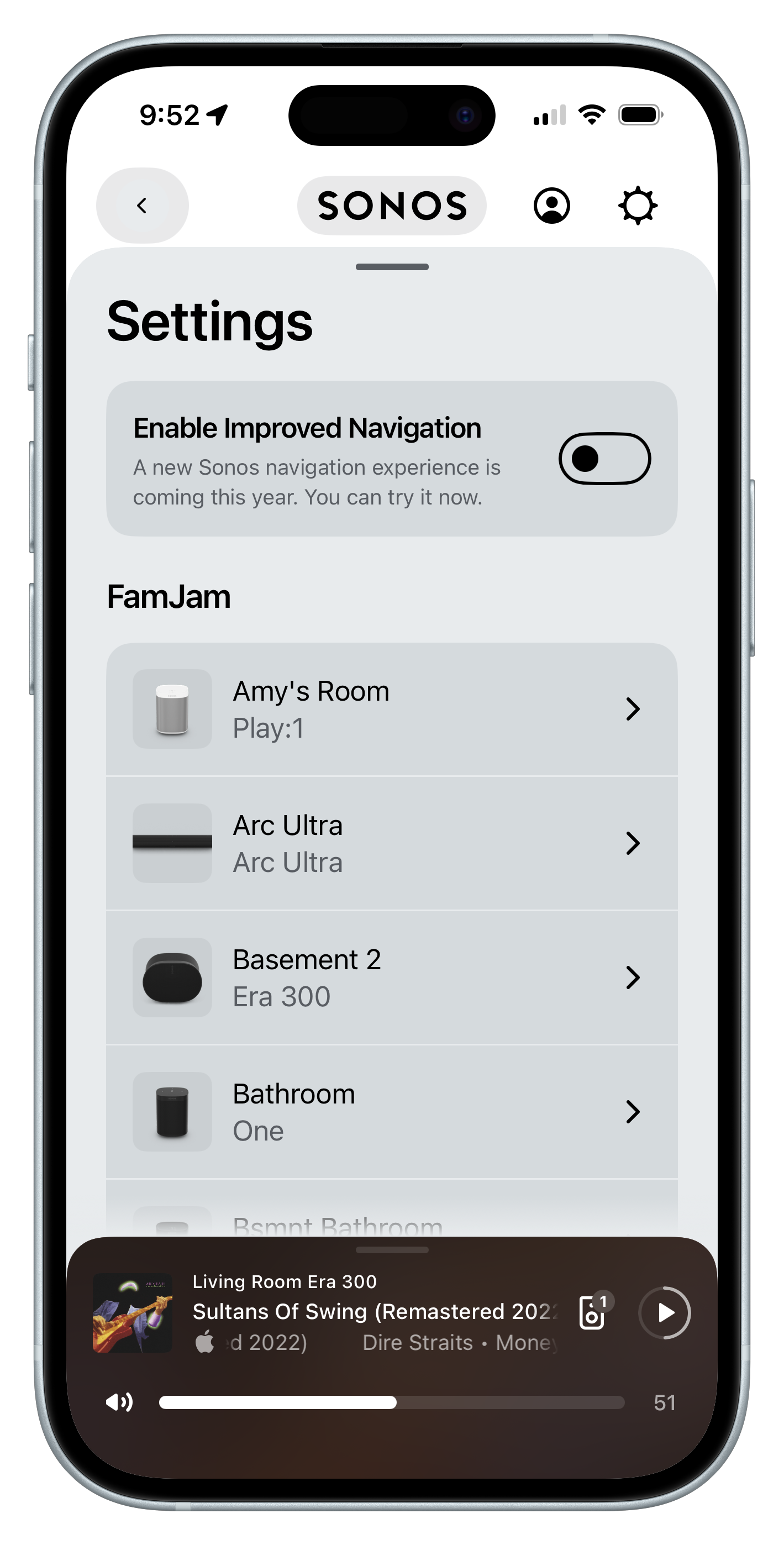
In the current version of the app (v87), at the top of the Settings screen, is a switch labeled “Enable Improved Navigation.”
Turn it on, and you’ll see a new set of persistent tabs at the bottom of the app, for Home, System, and Search. Within the System tab, you can now pin your favorite speakers to the top of the list and choose their order. And tapping on the volume slider reveals +/- buttons on either end for more fine-grained control than swiping your finger.
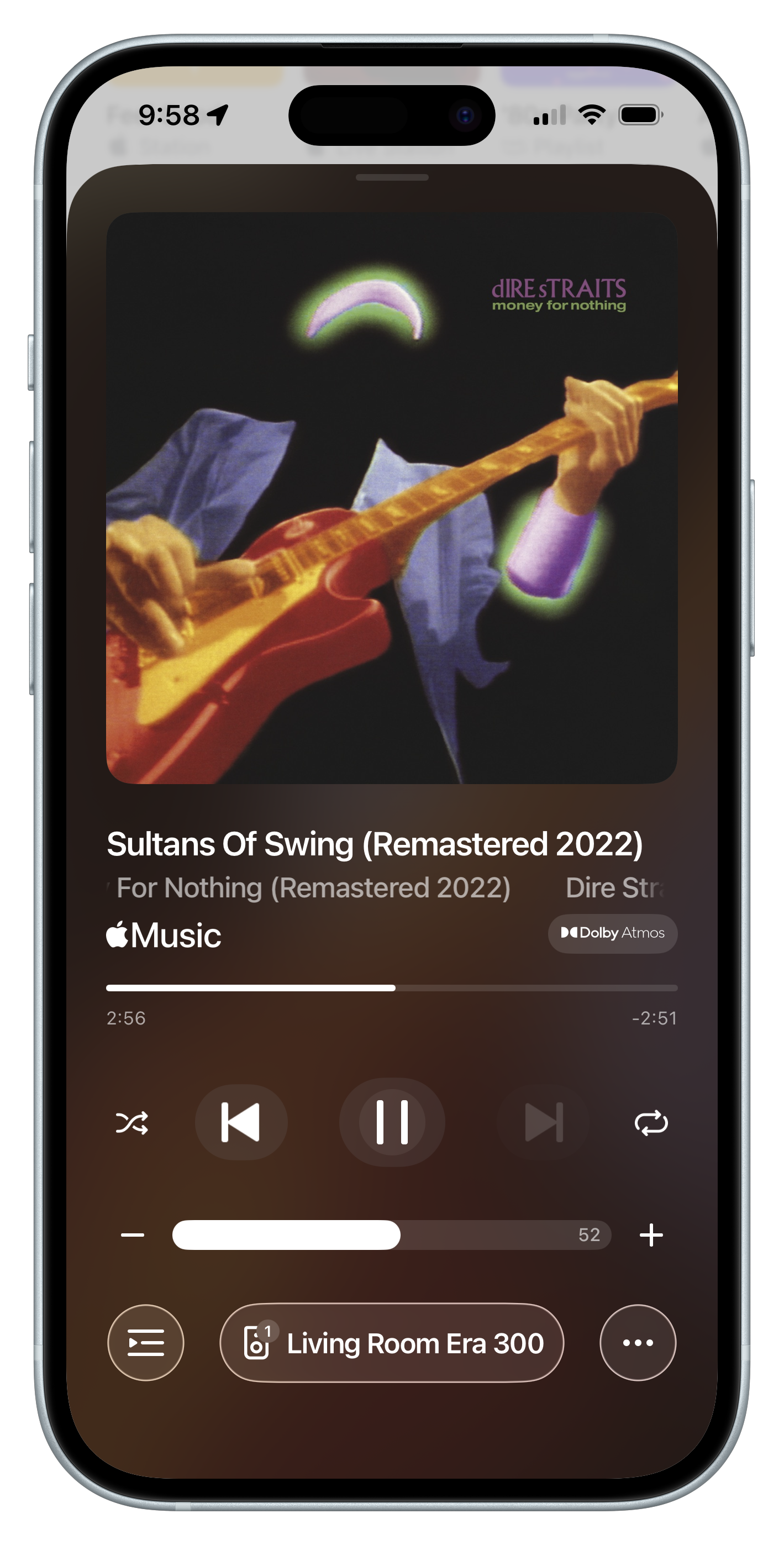
Sonos says it’s using this polite opt-in period to gather feedback and won’t make the changes the default until “feedback settles.”
Here’s my feedback: The changes are good but they don’t go far enough.
Bringing back the tabs
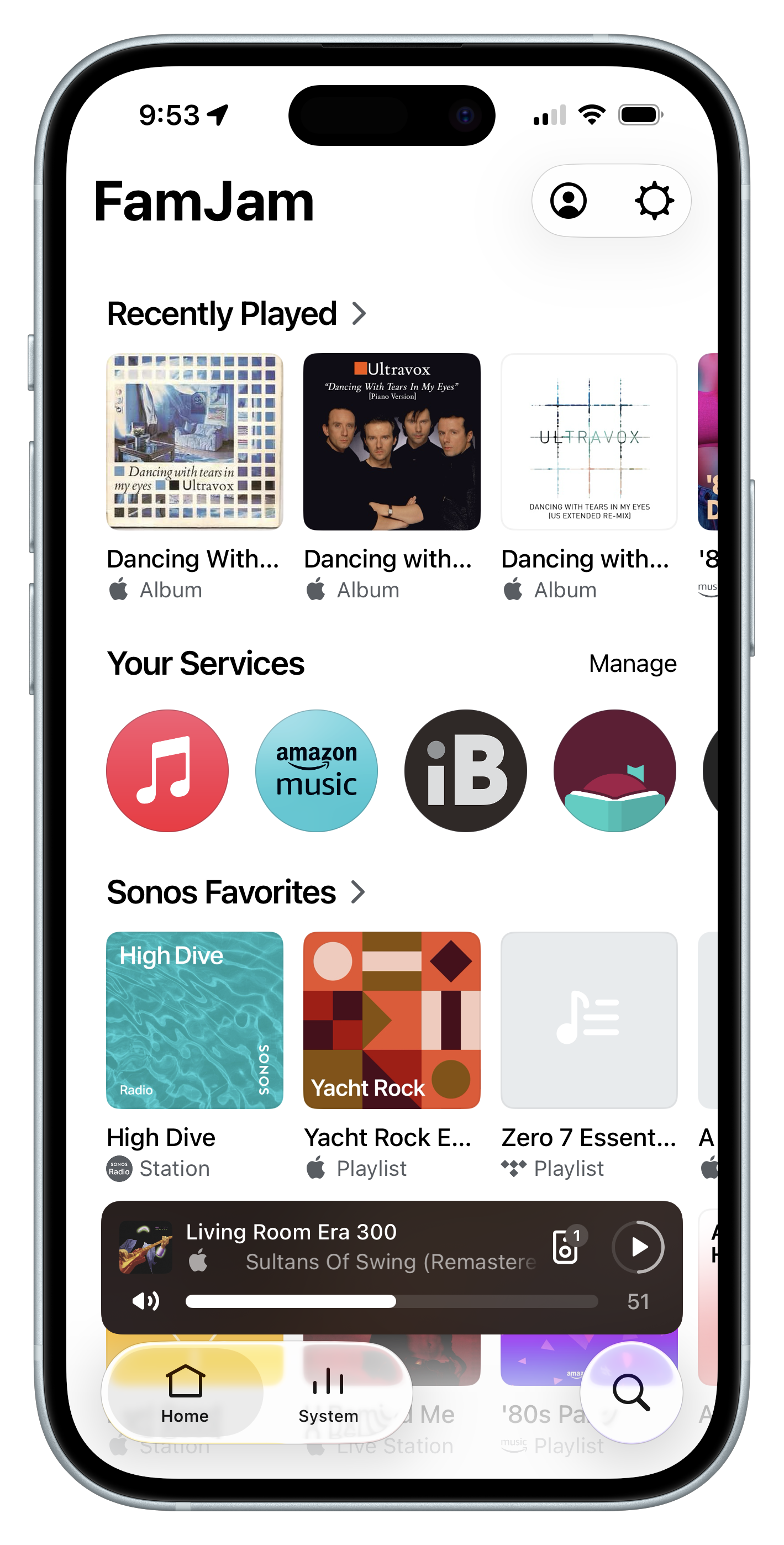
This is the smartest part of the redesign. It acknowledges that some parts of the user interface must be persistent to avoid a lot of unnecessary tapping and overlapping screens.
I like that instead of just bringing back the original five tabs (favorites, music sources, speaker selection, search, and system settings), Sonos has found a way to use just three (Home, System, and Search). I also like that on the iOS version, these tabs reflect Apple’s new Liquid Glass look and feel.
Home needs more help
The Home screen is unchanged, and that’s a problem. It continues to rely on a horizontally banded set of carousels, with almost no customization.
Take the Music Services section. You can’t expand it to see all of your services as a grid, and you can’t reorder them. You can only pick one preferred service, which is listed first; all of the others are then presented alphabetically.
Sonos Favorites suffers from the same lack of personalization.
System is slick
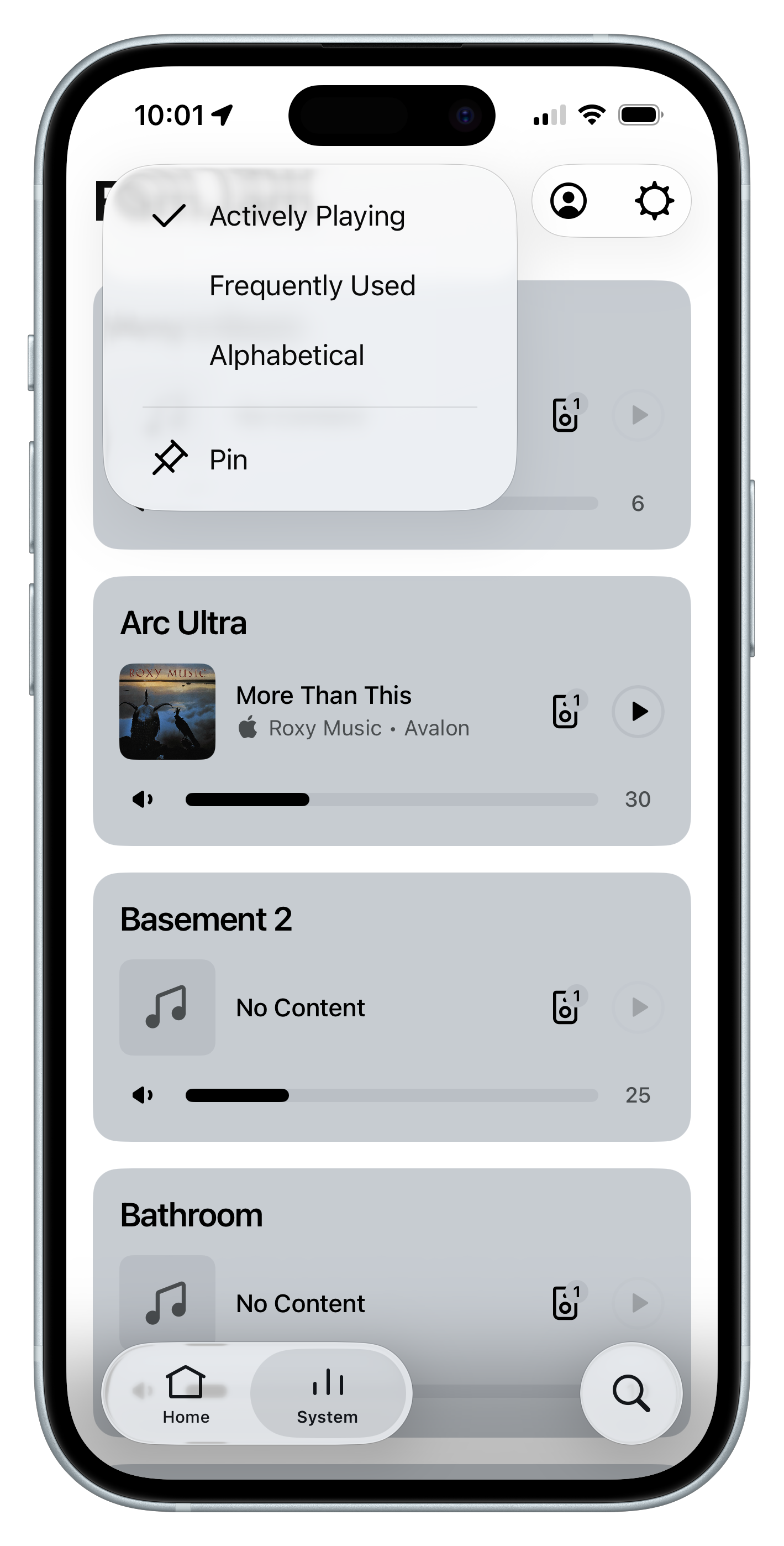
If your Sonos ecosystem is modest — maybe two or three speakers — you may not have given a lot of thought to the System tab. It can display three components at once, with no scrolling.
Four or more, however, and you become aware of the app’s preference for alphabetical lists.
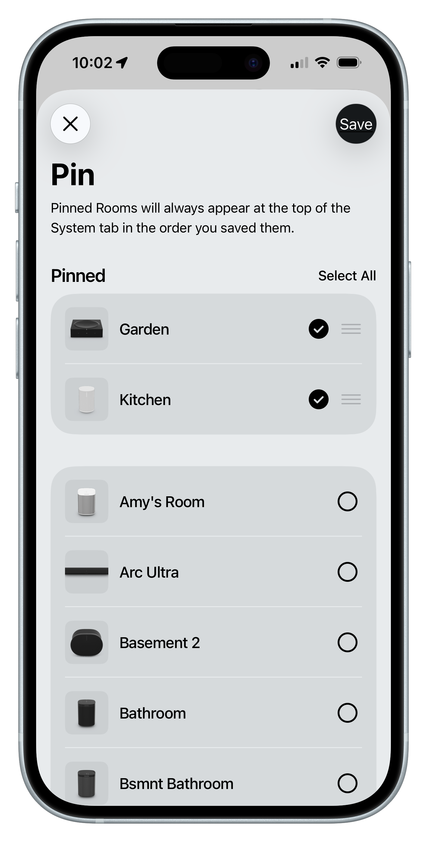
I’m delighted that there’s now a sort and a pin menu. You can change the sort from the default alphabetical to either Actively Playing or Frequently Used, but I suspect most folks will want to pin.
With pinning, you choose the speakers you want at the top of the list, and they can be reordered any time. Brilliant.
Still searching
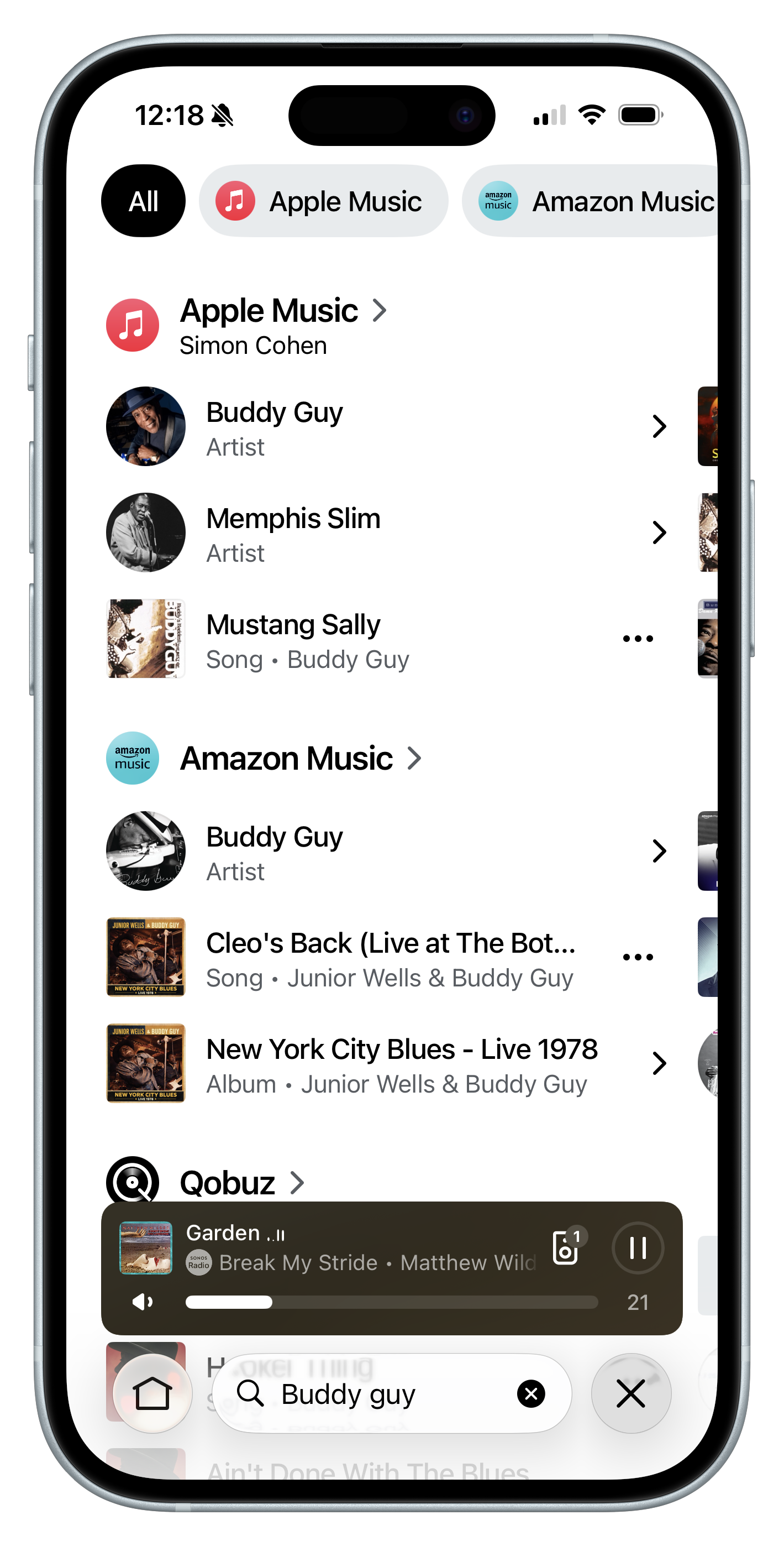
I’ve always said that Sonos’ universal search is its single best feature. For those of us with massive personal music libraries and multiple streaming services, being able to enter a keyword and get matches from all of these sources is awesome.
And now that we can flip back and forth between the Search and System pages, we’re almost back to the level of convenience the original design provided.
I say “almost,” because Sonos’ interface experts and I still have a beef over how people search.
Maybe it’s just me (entirely possible), but when you search for, say, Buddy Guy, you’re probably not thinking “I need to see which services have matching content.”
My guess is that you actually want to play some Buddy Guy. The only question that matters is, “Do you want to play one of his songs, one of his albums, or are you looking for playlists that contain his music?”
The same is true if you’re going for something less specific like a mood, e.g., high energy. Are you really concerned about what Apple Music considers the top matches for high energy, or do you want to see everyone’s matches for artists, albums, songs, and playlists, so you can quickly get to what you want?
Only once you’ve identified the kind of content you want does it become relevant to see which services have matches.
Here’s the kicker: Sonos’ search used to work this way. It changed with the 2024 redesign.
Now, results are always filtered by music service first (and alphabetically, of course). You can drill down into any of these services to then find songs, albums, etc. But at that point, if you can’t find what you want, you’ll need to jump into one of your other sources.
Too little, too late?
I’m thrilled Sonos is finally addressing the user experience problems it introduced in 2024. I’m also dismayed at how long it took to get here, and how few actual changes have been made.
In fairness, Sonos has said we can expect more soon, like the desperately needed return of iOS lock screen controls. However, even that update feels underwhelming given that it’s simply bringing back a feature we used to have.
Sonos has spent the last two years making its customers wonder if they should switch to another system. Bose has positioned its new Lifestyle Ultra speakers and soundbars as an app-free Sonos alternative*, and Wiim continues to make the case that its ecosystem is superior to Sonos, at least as far as its software is concerned.
The navigation improvements may slow the rate of customer defections but they’re hardly cause for celebration. And they do nothing to prove that Sonos is still capable of innovation.
Sonos has always bet its identity — for better or worse — on its software chops over its hardware-building pedigree. Until 2024, I’d argue that was a smart bet.
Now, however, that identity is bloodied and bruised. If the company wants to return to growth and profitability, and if it wants to put a smile on its customers’ faces, it needs to prove once again, that no one does audio software as well as Sonos.
It’s time for Sonos to step up.
*Almost app-free. You still need to use the Bose app for setup and EQ tweaks, but all search, playback, and multi-speaker management is now done through third-party apps and protocols like Apple AirPlay and Google Cast.
If you enjoyed this Loudmouth article, please consider subscribing. It supports my work and ensures you won’t miss out on future coverage.
This is amazing news and a terrific example of why your content is so timely and 100% worth subscribing for: it brings a critical bit of audio news directly into my brain, where I very much want it to be. Thank you! Also on an unrelated note, I love that your music choices include Sonos High Dive, Yacht Rock, Zero 7 Essentials, and 80s. Superb.